Brisbane

Brisbane's one stop app.
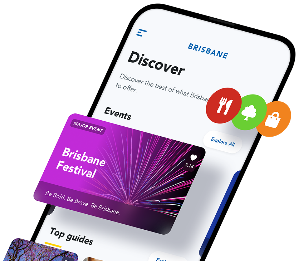
Graphic of the Brisbane app

Overview.

The Brisbane App showcases places, events, businesses and other services throughout the city. Built for visitors and residents alike, the app is a one-stop destination for things to see and do in Brisbane.
Strategy
UX and UI
Mobile app
Website
Infrastructure
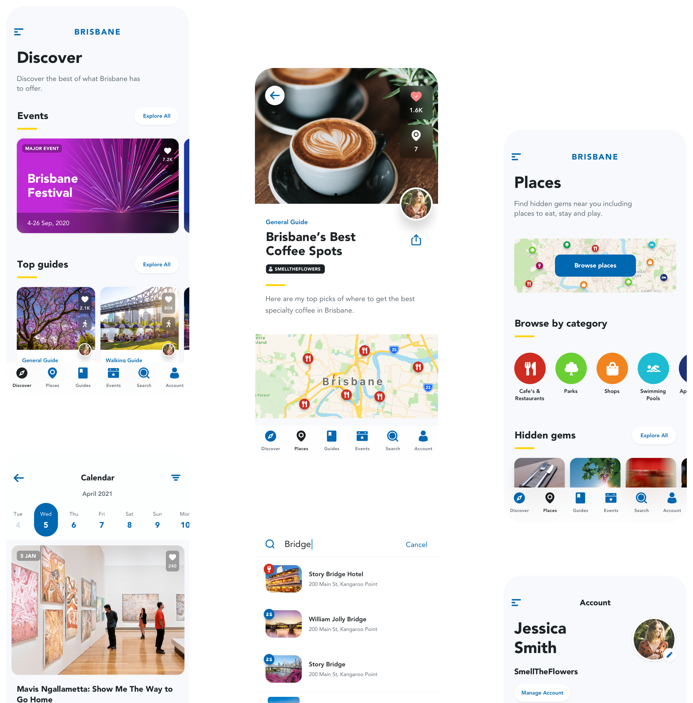
Screenshots of the Brisbane app

The app.

The Brisbane App provides a unique set of features to drive engagement and leverage the involvement of city residents. The app is free, publicly available and contains no ads. Any user can register and create their own Guide, consisting of a curated list of places within the city. The creativity of Brisbane's residents has been astounding, with guides created with themes as diverse as 'Date Night On The River', 'Top Markets for Artisans and Makers', 'Best Playgrounds' and 'Brisbane's Best Kept Secrets'.
By drawing on this local knowledge, the Brisbane App has found a way to rise above other listing apps and websites. Additionally, these content creators then become effective advocates for the app.
To help support the local economy, business owners are also able to register and create, or claim ownership, of their place of business within the app. These business owners can then add their own description and images along with a tool to publish promotional messages, which in turn send notifications to users that have 'liked' their business.
All these capabilities are provided entirely for free, creating a valuable public asset for the city.
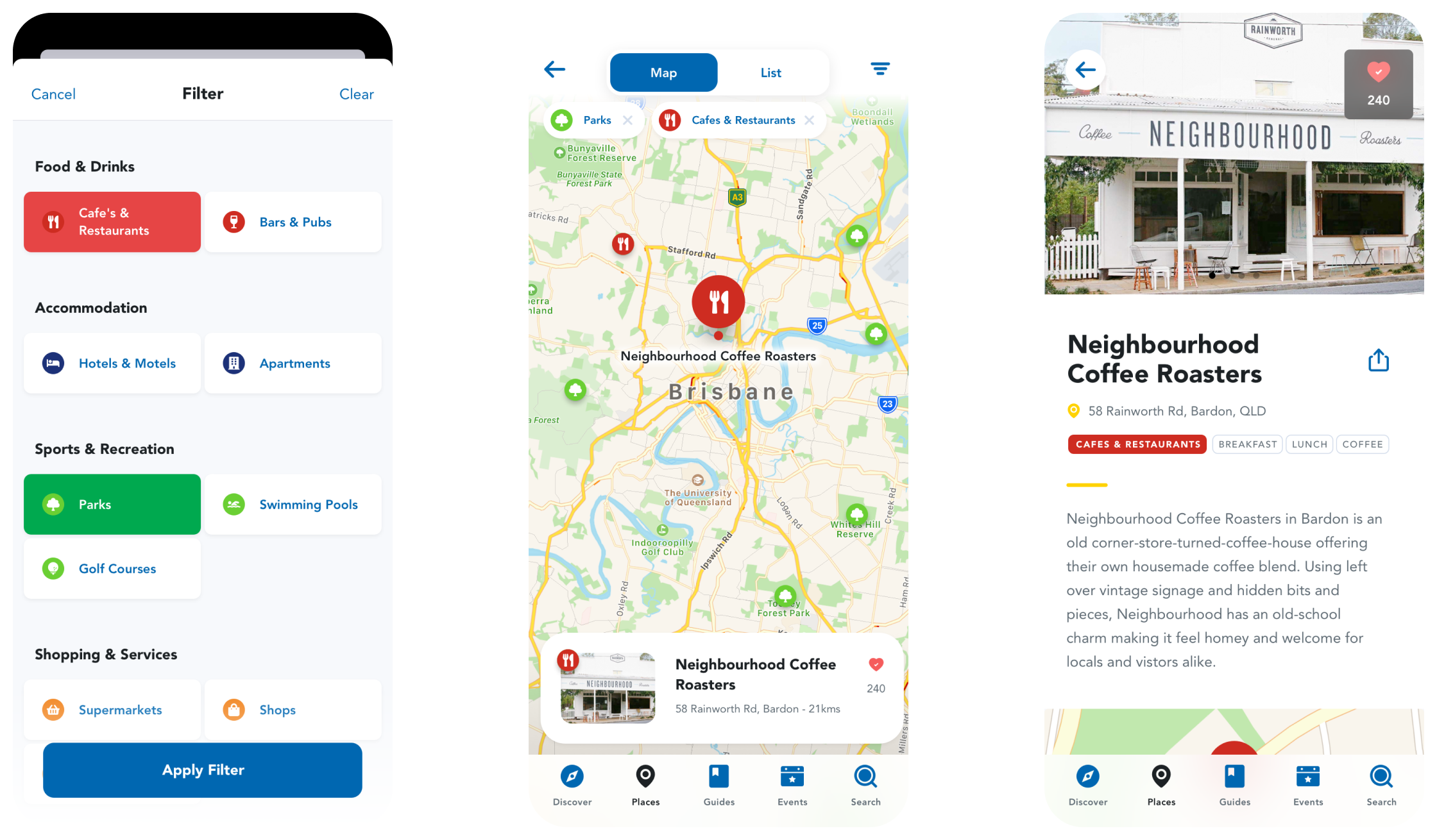
Screenshots of the Brisbane app

The brief.

The initial brief published by Brisbane City Council originally sought only an app that showcased the places and events in the city. The Council had some existing content on a section of their website that they hoped to re-purpose into a mobile app.
We Make Apps were able to leverage their experience building city-experience apps for Sydney, Newcastle and Perth to present Brisbane City Council with a more ambitious and engaging product. At the core of our proposal was a unique system of providing residents with simple tools to contribute content to the app, thereby creating a digital 'insiders guide' to Brisbane.
To their credit, Brisbane City Council embraced this vision and helped to direct additional resources within council to bring about its creation. In particular, Brisbane City Council were able to direct their experienced and formidable marketing team to help promote the app and reach that all-important critical mass of engagement required for digital products relying on user-provided content.

Wireframes

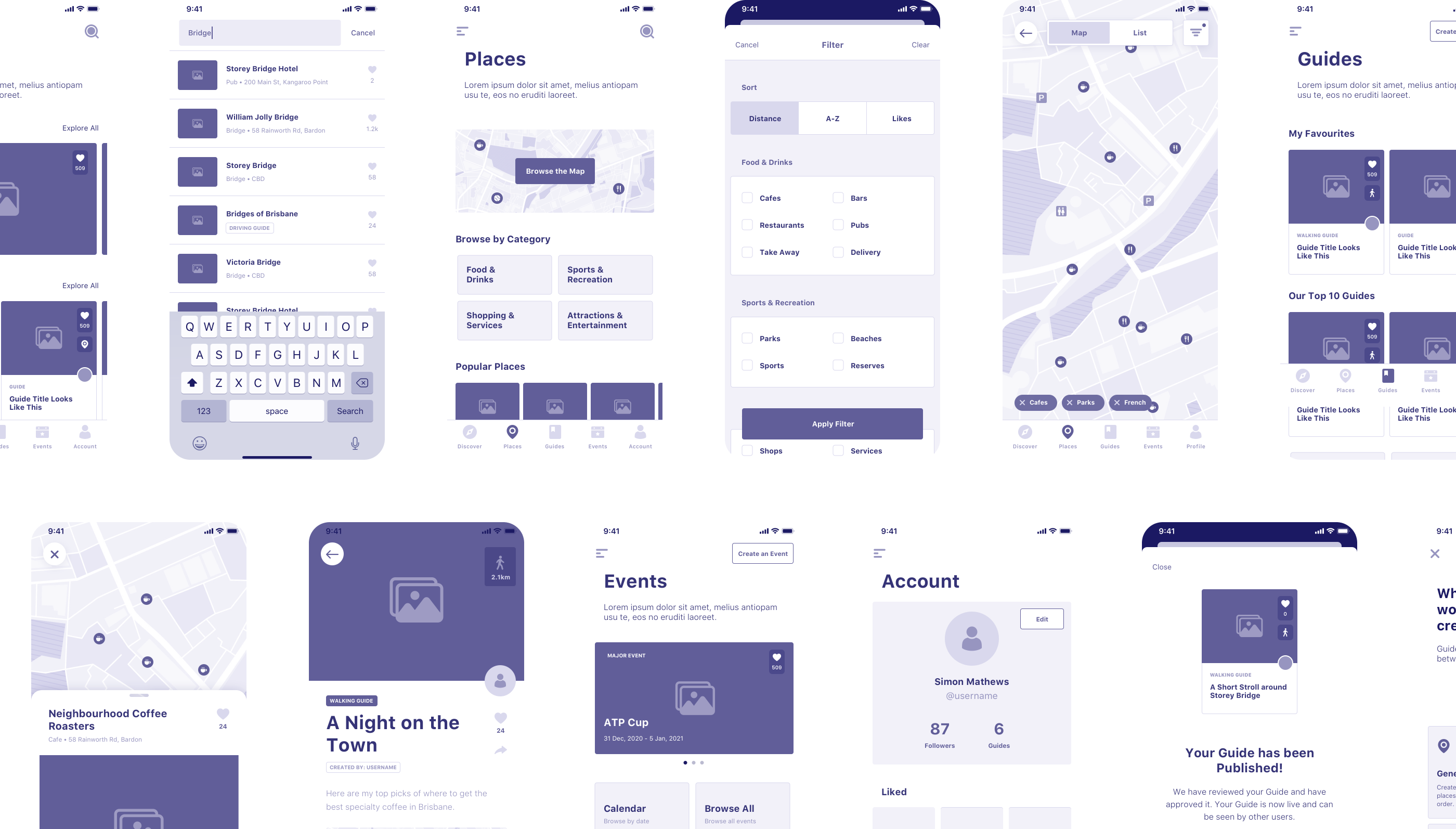
Wireframes of the Brisbane app

Project need.

Like all cities around the world, Brisbane was left reeling following the Covid-19 pandemic. To help support local businesses and to drive visitors and residents back to the events and destinations throughout the city, Brisbane City Council sought to create a digital showcase of their city in the form of a mobile app.
However, the app needed to be more than just another search-and-locate mapping app or another event listing tool. Importantly, the proposed Brisbane App needed to weave together content and data from wide array of internal and external sources. Parks and swimming pools were pulled from existing internal data sets within council, a consolidated feed of events was layered together from more than 20 separate feeds, and destination data was ingested from the Australian Tourism Data Warehouse API.
But these automated data sources were not enough - a truly usable showcase system needs engagement from the actual business owners and event organisers. The app, backed by an associated website, allows any user to upload information about their own place or event. The system is open to business owners and community volunteers.
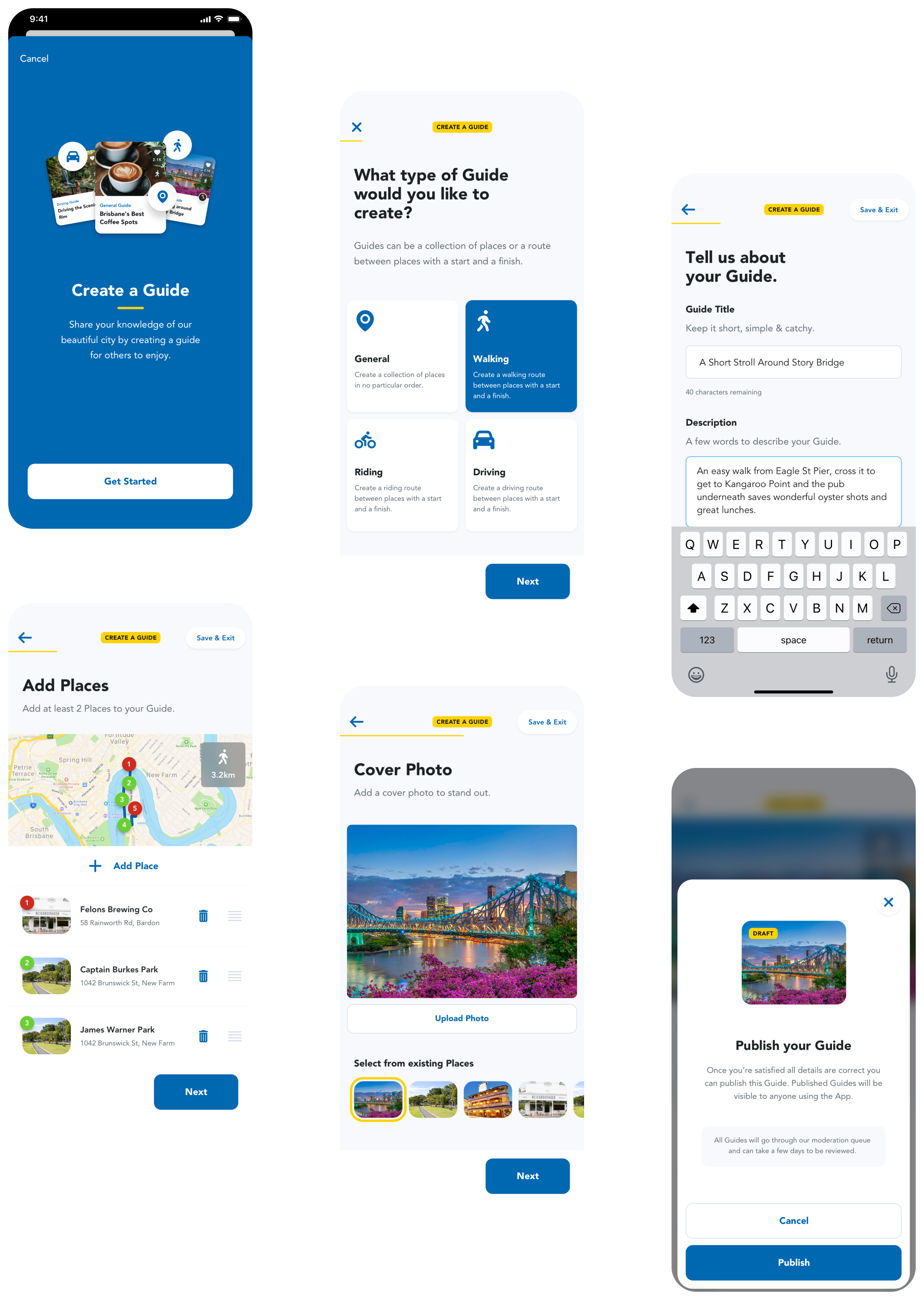
Finally, the killer feature, was user-curated guides. These allowed any enthusiastic resident to register and create their own themed guide from places already in the system. Users provided their own take on each place and provided their own images and copy. The app automatically creates walking, driving or cycling routes between each place.
Screenshots of the Brisbane app

User experience.

The Brisbane App is designed to be used by a very wide range of users - essentially any resident or visitor throughout the entire city. There is no target demographic or minimum expected level of technical savvy. Ensuring a smooth, intuitive, user experience was recognised as a key factor in the overall success of the project.
Getting that user experience right was a substantial challenge. The app needed to support casual, anonymous users, who perhaps install the app and use it on an ad hoc basis to find events or places near their own location. But at the same time, the app provides a much deeper experience for business owners and guide creators.
The set of requirements for guide creators, in particular, were subtle and involved; yet if these tools were too complex or confusing to use, we would miss out on that critical mass of content creators.
The design process for the Brisbane App took months, and covered an extensive initial wireframing phase, full designs, and iteration of those designs through a series of informal and formalised usability testing.
Finally, the app was also built to meet accessibility guidelines from the beginning. Substantial effort was put into meeting AA accessibility guidelines, including an audit by accessibility specialists at the Centre for Inclusive Design.
The alternative (unchosen) icon for the Brisbane app.

The unchosen one.

This was our original icon designed for the Brisbane App. While well liked within our team, it was ultimately replaced by a simpler icon. There are some battles you can’t win, no matter how much you fight.
Previous case study Next case study